App onboarding —
The Points Guy
The Points Guy App was barely 6 months old when I joined the team and did not have a dedicated content resource. Thus, a lot changed in the 2+ years I worked on it.
One major milestone (that I am embarrassed by how long it took to get live) was the fresh onboarding flow.
Ideating a new flow
In its early versions, there was no onboarding to speak of. The app entirely relied on context, tooltips, and null states to provide information and guidance. But, with a major overhaul in the app's functionality, we finally found time to go back and start from square one.
This was a fun project. Not only did I get to work closely with one of our product design leads, but I also got to lean heavily into UXR.
Taking a content-first approach
This was the first time we led with content and made it the focus of our user studies. I’d go on to take these learnings and apply them across more projects and updates, but we’ll focus on one thing at a time.
Here are some screens of the early planning I put together solo:
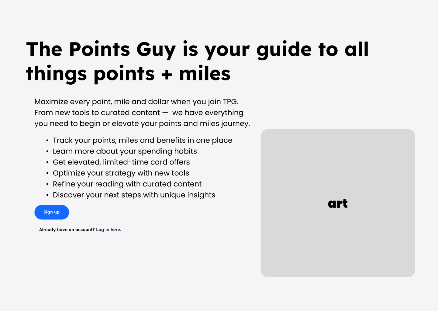


The intent in this early version was to explore content in a way we could reorganise for an optimised experience based on UXR and discover what information we could collect from the user.
Developing multiple flows
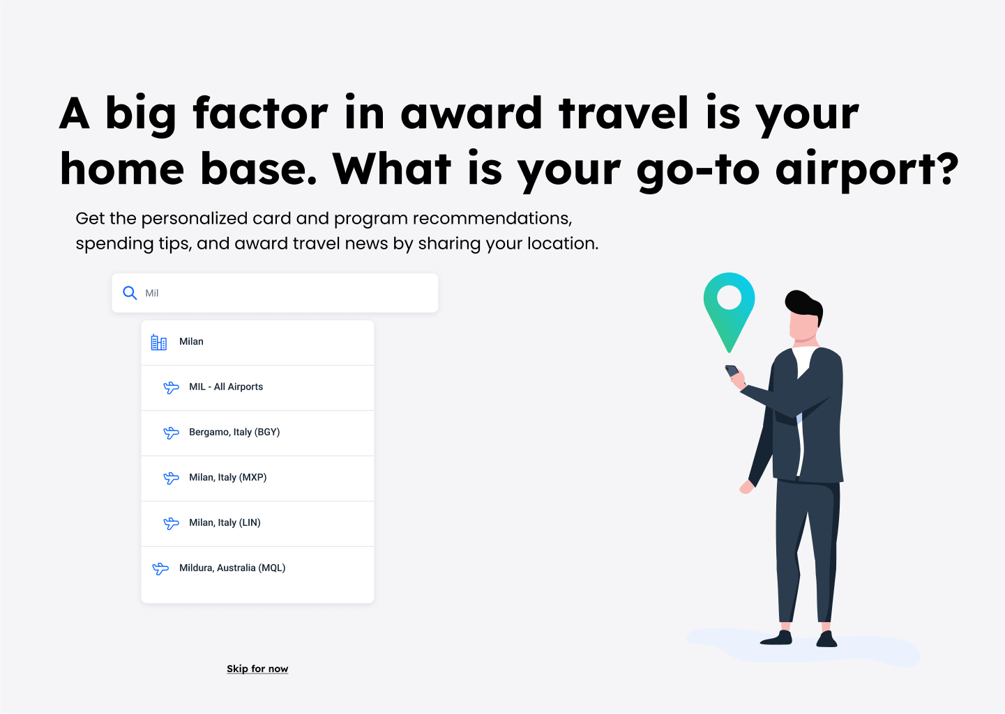
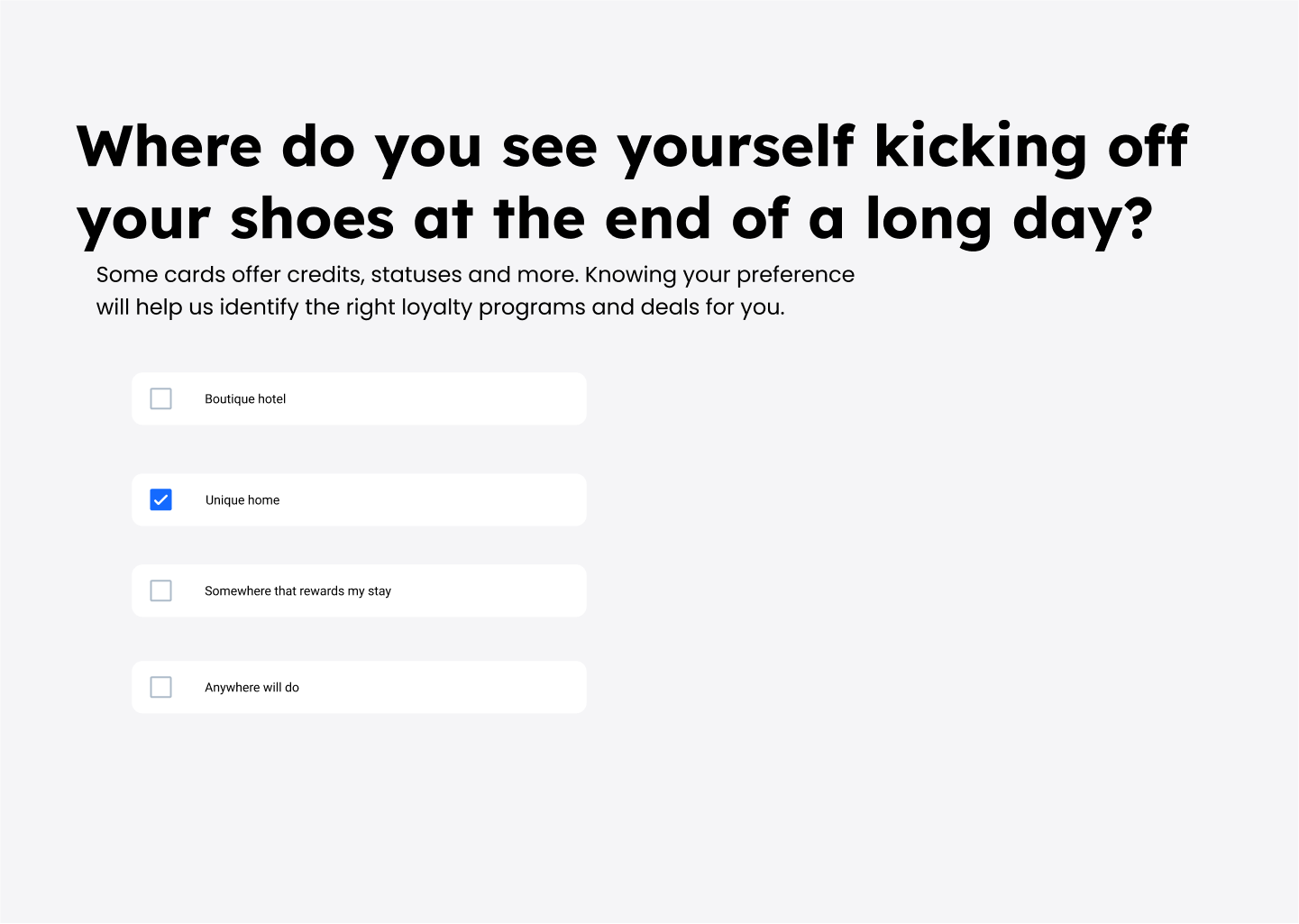
After that initial exploration and some user research, we moved forward with two flows to design and prototype. The first was meant to be as concise as possible. Get the necessary information to build their profile, then have a ‘tour’ experience when the user clicks through the app:


The second version we tested against was more in-depth. We went in aiming to get as much information as possible; name, bank information, notification and travel preferences, and more were covered throughout the flow:


Working through UXR
I sat in nearly every unmoderated user session and took notes on every comment our volunteers made. Some were great! Others were not-so-great. But they all added up to a bigger picture.
Our big findings vindicated my hypotheses. First, new users would be uncomfortable sharing any banking information, (even though we detail our security), and some of our chosen brand language (from before the style guide I wrote) was obfuscating our direction and value.
Going through it again, I worked with another designer for further exploration.
Bonus: How I visualise content
A big content task to settle on was our brand direction. We were in full swing redefining our brand at this point and needed to make some decisions on the balance we’d strike between credit cards and travel. Here’s a peak into the process of how I work visually:
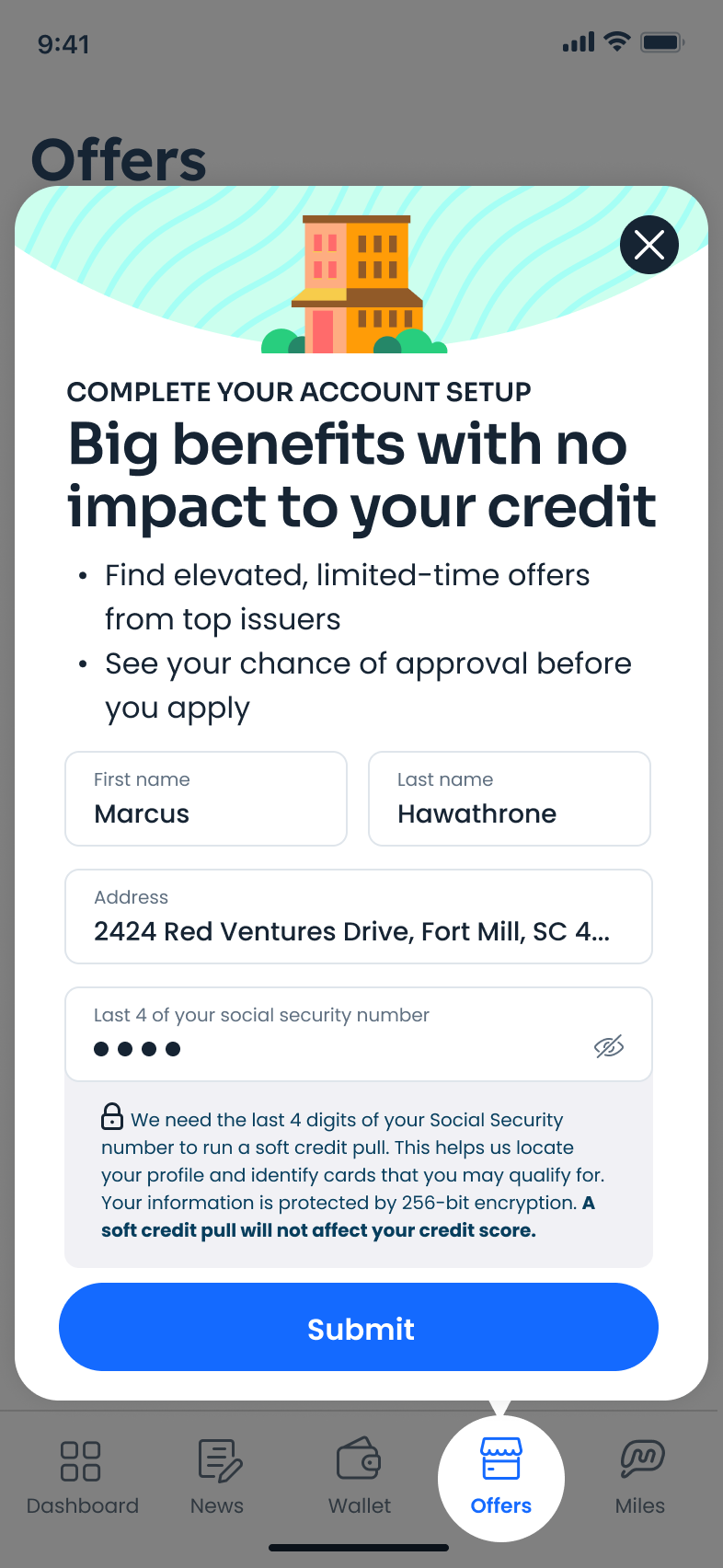
The results
After some rounds of feedback with stakeholders, a final batch of users and multiple presentations with senior leadership, we settled on a flow that balanced our new brand pushes with the clarity and engagement users need. Here are some snippets below (shipping Q3 ‘24).


Landing in the TPG App
Finally, as a bonus, here is a screen grab of where the user lands after onboarding.
I worked on every piece of content on this screen from top to bottom.
I mocked lo-fi in Figma as I laid out content, worked through hi-fi brand moments with our visual team, brand language with senior leadership, validated with UXR and continued to follow up with eventing from our engineers.
This state of the TPG App was the product of two-and-a-half years of trial, error and exploration.

Liked this? Check out some of my other work:
Brand style guide — ChatGPT voice & tone — Retargeting emails